

Dashboards
Widget types
The nine kinds of widget and the fields that belong to each. Drawing and arranging them is in Placing and arranging widgets.
| Tool | Shown as | Per dashboard |
|---|---|---|
| Text | text | 160 |
| Shape | shape | 96 |
| Bar | bar | 48 |
| Arc | arc | 24 |
| Lights | indicator | 12 |
| Graph | graph | 6 |
| Image | image | 64 |
| Slot | slot | 12 |
| Tap zone | shape | counts as a shape |
Shown as is the name the inspector prints beside a widget’s name, and the one a configuration file uses. The counts are for the whole dashboard, all its screens together.
What every widget has
The inspector lists a widget’s fields in folding groups: first those of its own kind, then Title, Box, Conditions and Action, which every kind except the slot has, and Geometry, which every kind has. Elsewhere in these guides: Conditions in Conditions and colours, Action in Screens and pages, Geometry in Placing and arranging widgets.
Title
| Field | What it does |
|---|---|
| Text from | A field the caption reads instead, such as track.name. The text stays as the fallback, shown until the field arrives and whenever it is empty. This and the fields below appear once the caption has text. |
| Anchor | The top and bottom rows sit across the border line, the middle row inside the box. |
| Cut border (Advanced) | On by default: a caption on the top or bottom row breaks the border line instead of being drawn over it. |
| Cut padding (Advanced) | Clear space on each side of the caption in the cut, 0 to 240 px, default 4. Shown while the box has a border and Cut border is on. |
Box
| Field | What it does |
|---|---|
| Fill corners | rounded (default) or square: how the background and a bar’s fill meet rounded corners. Shown while the radius is above 0. |
| Padding X, Padding Y (Advanced) | Space kept clear inside the box, left and right, top and bottom, in pixels. It moves what the widget draws, never the box and never a container’s children. |
| Inset (Advanced) | Shrinks the background inside the border by this many pixels, so a widget whose background turns red keeps its frame visible. |
Text
A reading: speed, gear, a lap time. It always reads at least one field; a fixed word belongs in a Title. A new text widget is 120 × 64 px and reads vehicle.speed.
Its sources are in Turning a value into text and Fallback in When there is no value. A new widget takes the font under New widgets in the dashboard settings.
Shape and tap zone
A shape draws its box and nothing else: a panel behind a group of readings, a frame, a divider — a line is a thin rectangle. Kind picks rectangle (default) or ellipse. A shape can also hold other widgets: see Containers. A new shape is 160 × 80 px with the background #1E293B.
The Tap zone tool draws a shape with no background and no border. A click without dragging places a 96 × 96 px zone. What it does is set under Action.
Bar
A bar fills in proportion to one value: pedals, fuel, a centred delta. A new bar is 200 × 24 px, reads vehicle.throttle and has the background #1E293B. Binding, Modifier and Range are in Showing live data.
| Group | Field | What it does |
|---|---|---|
| Data | From origin, Origin | Off by default. On, the fill runs between Origin and the value instead of from the minimum: a range of −1000 to 1000 around an origin of 0 makes a centred delta bar. |
| Bar | Gradient | Lays colours along the whole track — Fill at the minimum, an optional Middle and the End colour — and the fill uncovers them as it grows. Turning it on starts with #FFD400 and #D50000. |
Arc
An arc shows one value around a ring: a rev ring, a dial. A new arc is 120 × 120 px, reads engine.rpm_percent and has the track colour #1E293B. Its Data group is a bar’s without the origin; the Arc group holds the rest.
| Field | What it does |
|---|---|
| Mark | ring (default) fills the ring up to the value. needle points a line from the centre at it, as thick as the ring and over the same track, and hides Centre on and the offsets unless they were set before. |
| Centre angle | The middle of the ring, 0 to 359 degrees, default 270. 0 is three o’clock and the angle grows clockwise, so 270 points straight up. |
| Sector | How much of the circle the ring covers, 1 to 360 degrees, default 270, half on each side of the centre angle. |
| Thickness | Width of the band in pixels, default 8. The slider stops at 64; type a larger number if you need one. |
| Radius (Length for a needle) | Shows the radius the box gives. Typing 1 to 2048 px pins your own, which may be larger than the box: the widget still stops at its box, so only the part of the ring crossing it shows, such as a shallow band across the top of a round screen. 0 goes back to following the box. |
| Centre on | circle (default) puts the centre of the ring’s circle in the middle of the box; figure centres the band that is drawn. |
| Gradient | For a ring: colours laid around the whole sector, uncovered as it fills. The board prepares them as a picture the size of the ring, so a ring with a radius of its own must not be wider than the display. |
Lights
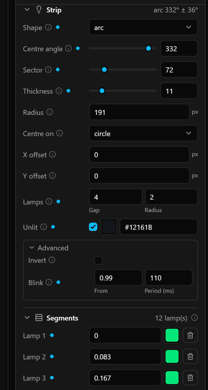
Lamps that light one after another as a value climbs: shift lights, a rev strip, the rev ring of a round dial. Each lamp lights at its own fraction of the range, so one widget suits any engine. A new Lights widget is 240 × 20 px and reads engine.rpm_percent with six lamps: green at 0.5 and 0.62, yellow at 0.74 and 0.84, red at 0.92 and 0.97.
| Group | Field | What it does |
|---|---|---|
| Strip | Shape | strip (default) runs the lamps along Orientation, horizontal or vertical. arc spaces them around a sector and shows the ring fields of an arc instead. |
| Strip | Invert (Advanced) | Lights from the far end without changing which lamp lights when, so one design placed twice makes a mirrored pair. |
| Strip | Blink (Advanced) | From: the fraction of the range from which every lit lamp blinks; the default, 2, is never reached. Period (ms): 0 for no blinking, or 100 to 5000, the time each lamp stays on and off. |
| Segments | Lamp 1 to Lamp 16 | The fraction of the range, 0 to 1, at which the lamp lights, and its colour. A lamp’s fraction may not be lower than the one above it. Add lamp, under the last lamp, copies it. |
Graph
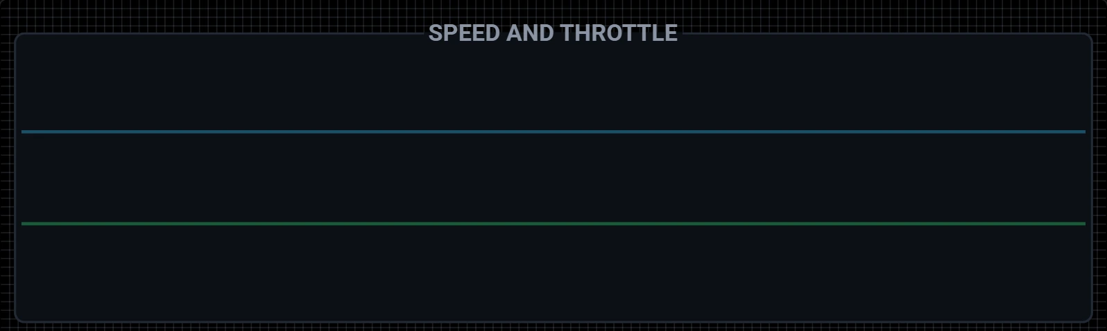
The recent history of up to three values on one plot, such as speed with throttle and brake. It takes its samples on its own clock. It is the most expensive widget for the board to draw, so keep the number of points no higher than you need. A new graph is 200 × 80 px, reads vehicle.speed and has the background #1E293B.
| Group | Field | What it does |
|---|---|---|
| More traces | Trace 2, Trace 3 | More values over the same plot, each with its own field, range and line colour, so speed and throttle share one plot without either flattening. Add trace adds one that reads vehicle.speed. |
| Plot | Window | Points, 2 to 128, default 64, and Interval (ms), 1 to 65535, default 100. The plot covers points × interval: 6.4 seconds by default, shown beside the group name. |
Image
A logo, a background, an icon, or one frame of a sprite sheet. The board neither scales nor rotates it, so give the widget the size of the picture; resizing the widget does not resize the picture. A new image is 96 × 96 px. Its fields are in Show an image on the dashboard.
Slot
An area that shows one of its pages at a time. It draws nothing itself and sits on a screen, never inside a container, so it has no Title, Box, Conditions or Action. A new slot is 200 × 100 px. Its pages and fields are in Slots and pages.
Good to know
- A ring or a lamp arc too thick for its box keeps the configurator from saving, and the message says so. Give it a radius of its own or a bigger box.
- On an arc, lamps and gaps are rounded to whole degrees and the row is centred on Centre angle, so the lamps may not fill the whole sector.
- A colour with a tick box beside it is optional: unticked means no colour at all, not black.
Limits
| What | Limit |
|---|---|
| Caption text | 15 bytes: a plain letter takes one, an icon three |
| Sources in one text widget, values in one graph | 3 |
| Lamps in one Lights widget | 16 |